Handshakey App – UX/UI Casestudy

Various UX/UI Projects
August 18, 2019
Rockit Conference – Brand Identity
May 16, 2017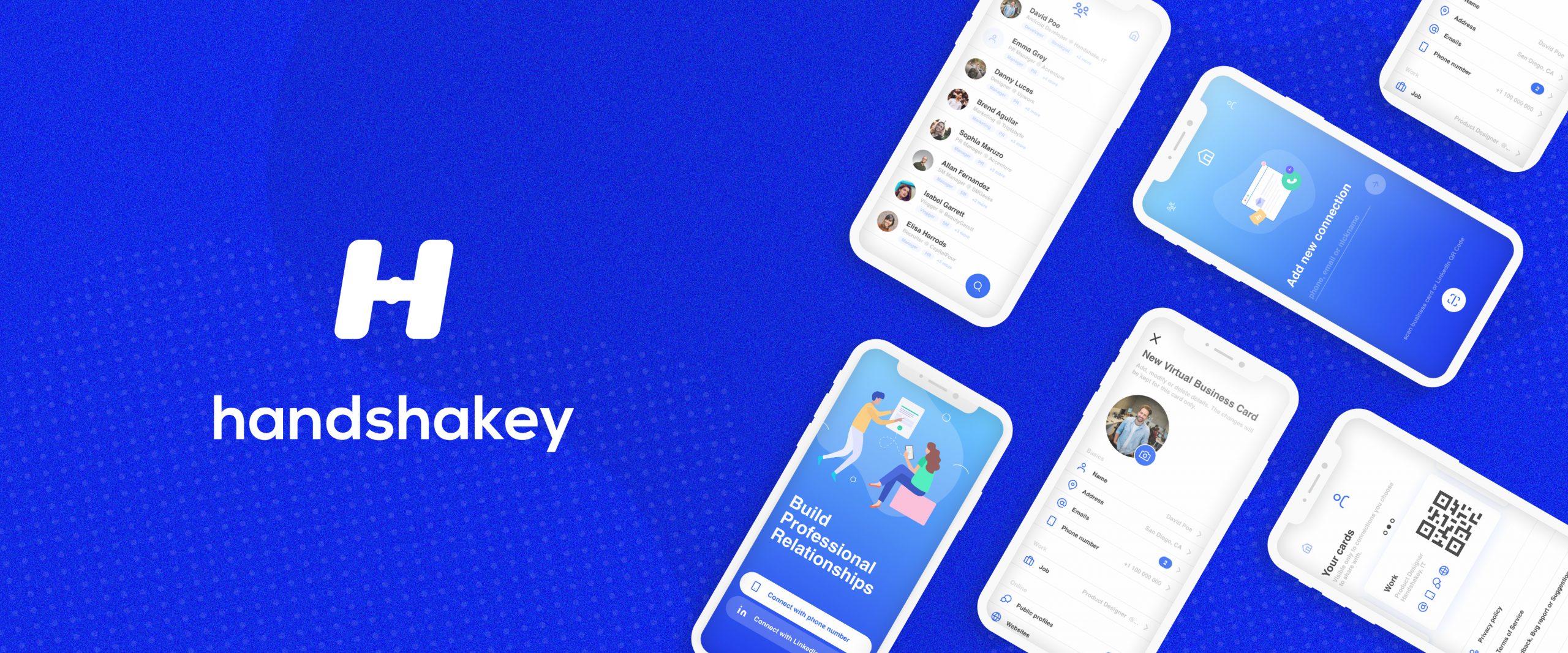
All-in-one platform to seamlessly connect,
personalize and build a professional network.
My role for this project was to work together with UX/UI Lead on developing the iOS and Android apps.
PROJECT OVERVIEW
Handshakey is a startup that has a big goal: help people create start Building Meaningful Connections
• UX/UI Design taskss - User personas, competitors analysis, wireframe and prototype, usability testing, hi-fidelity mockups
• Visual Design - Logo, color, type, set of illustrations, design concept for the homepage, design components
• Visual Design - Logo, color, type, set of illustrations, design concept for the homepage, design components
THE PROCESS
Explore · Ideate · Sketch · Present · Iterate · Propose · Finalize
To solve the identified problem, I designed Handshakey - a user-friendly app that contains a database of available residential properties. The app provides reliable, uncomplicated information about users’ potential property investments. Buyers will use this tool when conducting property searches, making a decision about where to invest and contacting the right people when they’re interested in viewing a property.
RESEARCH & IDEATION
Deliverables: Logo · Typography · Color · Brand Elements · Digital · Print/Merch
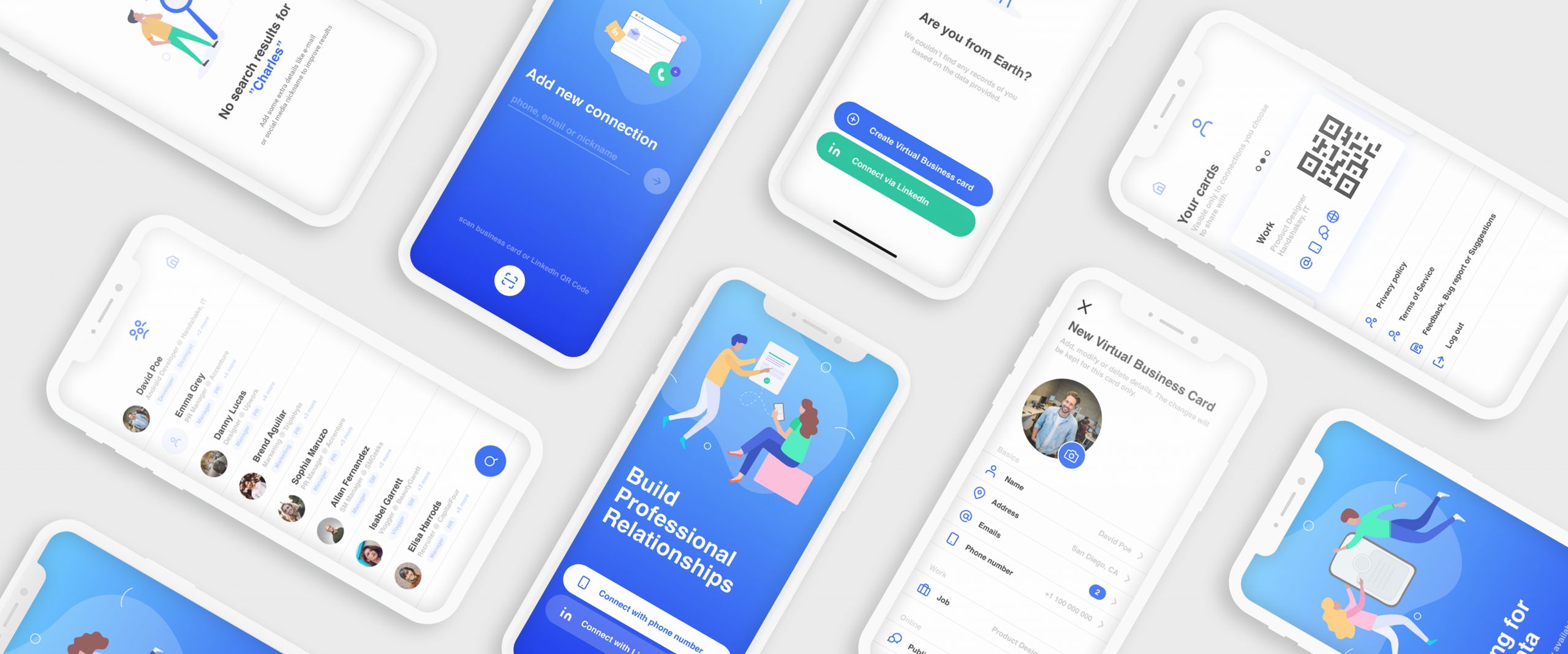
We conducted around 10 interviews with potential users who attend networking events and are interested in building or maintaining their network of people. Our goal was to study their behaviors and identify what apps do they use to network/connect with people, do those apps cover their needs, what are their frustrations, and most of all, what are their real needs.
EXPLORATION
Deliverables: Logo · Typography · Color · Brand Elements · Digital · Print/Merch
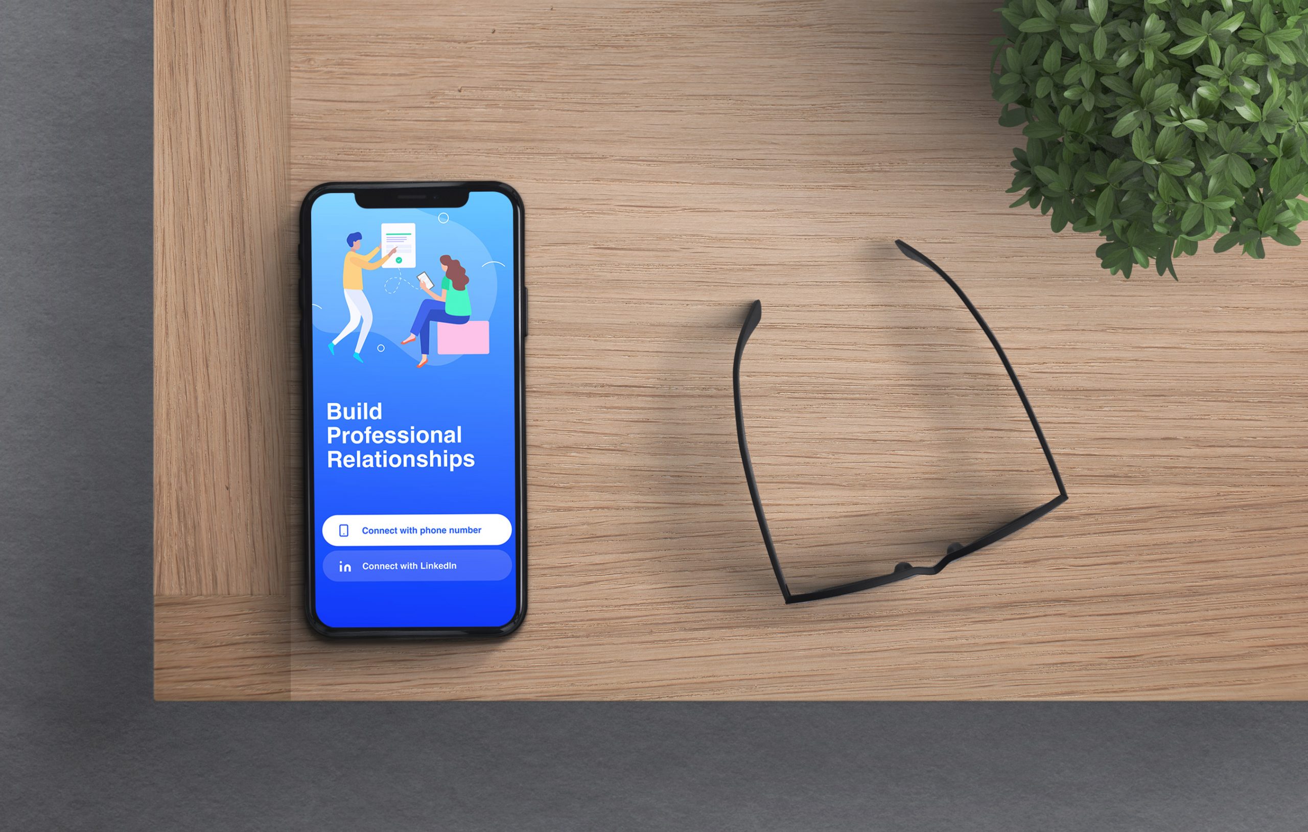
The team explored many different navigation options, including the hamburger menu and bottom navigation. After some validation testing, we decided to go for Gesture-Based Navigation between the 3 main pages: Home, Connections, and Profile.

SOLUTION
A modern, eccentric and clean look and feel
The use of geometric shapes allowed me to create a dynamic and modern look and feel that would enhance the connection between the brand and its target users - the millennials. The vibrant colors and bold shapes support the brand's value and evoke feelings of professionalism and trust. Overall the identity concept, colors, and shapes make KOMETA stand out from media competitors in Moldova.
RESULT
Deliverables: Logo · Typography · Color · Brand Elements · Digital · Print/Merch
As a result, I created a branding style guide that connects to the brands' purpose of becoming a premier digital platform that delivers news that people can trust.
